Reimagining the Gorgon: Moving from Thumbnail to Multi-Media Exploration

Reimagining an Old Composition
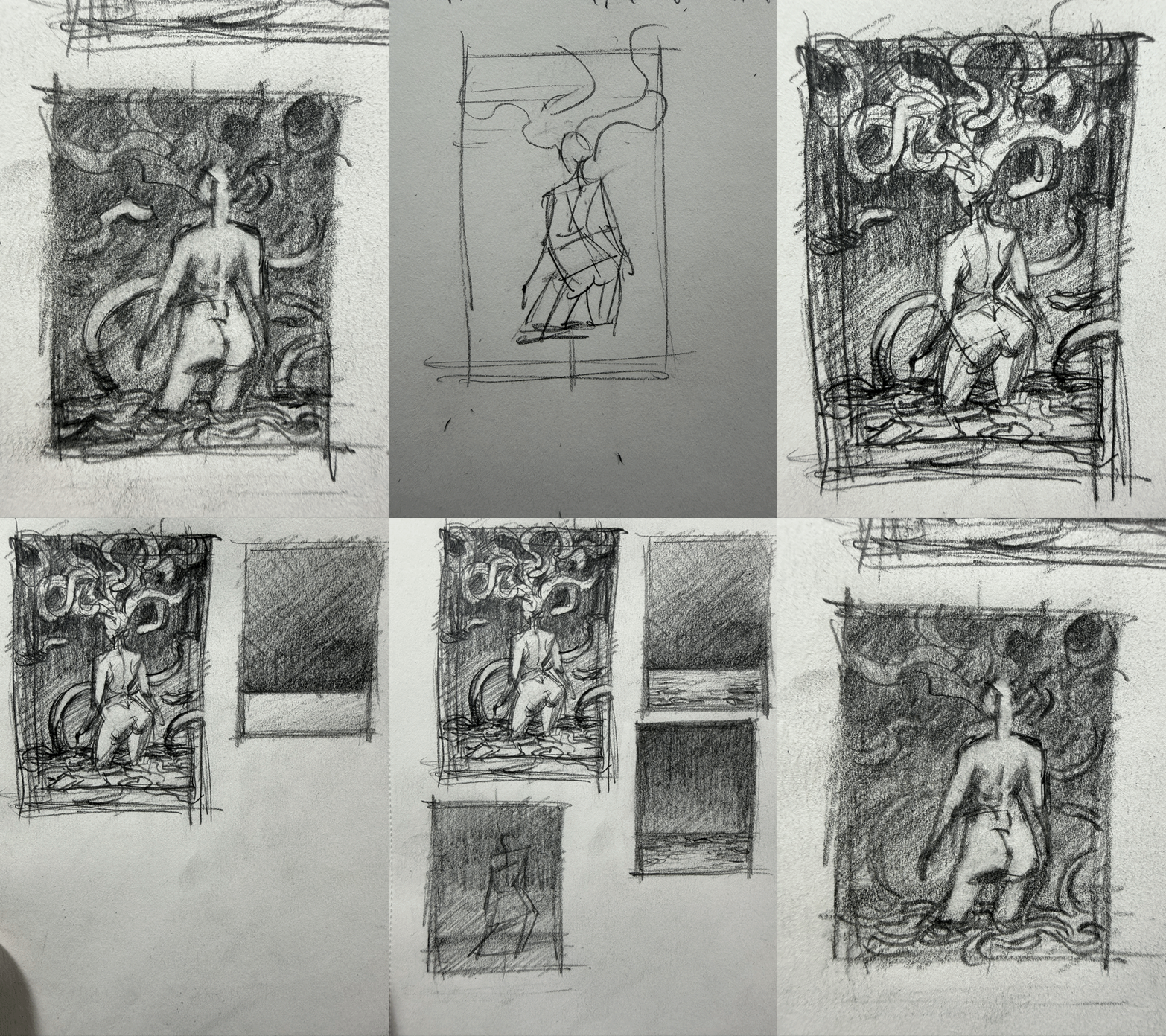
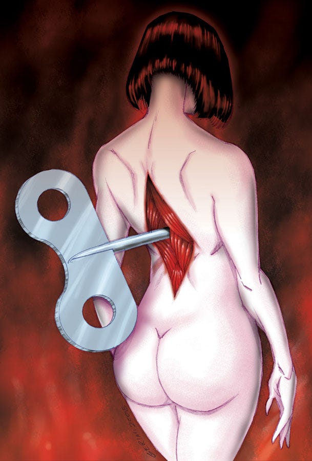
I did a rough sketch—a thumbnail drawing—of a new illustration that I want to work on. The idea is taking my piece Wound, which featured the woman with the windup key in her back, and instead of using the same composition, replacing her with a Gorgon. It’s just part of my current deep dive into drawing Medusas.
The line drawing is just the initial basic thumbnail in terms of me working out the pose and what I want the piece to be, but the exploration needs to go further. Next, I actually need to work out the tonal values. My desire is to work out the values both in pencil and, honestly, in paint before I go to a final illustration.
In fact, I think I may end up doing this illustration in multiple media just to figure out exactly what I want. I’m thinking about doing a finished pencil line drawing, a finished ink and brush drawing, a tonal charcoal drawing, and then maybe taking either the pencil line art or the ink drawing and doing a digitally colored version of that. All that to say, this is just the beginning of the process of working out values in thumbnails.
Solving the Background Tone Puzzle
As I was working, I realized that I still wasn’t sure where I wanted to have the ground plane shift in terms of tone. If I just have the dark value go all the way down and then have it come out of the front, it doesn’t feel quite right. To me, it seems like there should be a back wall somewhere in there—a place where the dark values of the background get slightly lighter or slightly darker before they shift into the foreground.
To solve this, I did a couple of little thumbnails to the side where I was just drawing squares with no figure at all. I wanted to see what happens if the background is lighter at the top, goes all the way to black, and then you’ve got a ground plane that is lighter in the distance and darker in the foreground. Then I tried reversing that: what happens if it’s darker at the top of the background, getting slightly lighter at the bottom, and then the deep background of the ground plane is very dark, getting slightly lighter as it moves forward?
I think that second option is what I prefer more, but I wanted to just test it out in pencil first. The fact that it only takes about five minutes to draw these little squares for value studies makes it a really, really useful habit for working out composition.
Next Steps in the Process
The next step is going to be finalizing the tones and values on this current thumbnail. From there, I’m going to move into doing some watercolor thumbnails, and we’ll see where it goes.
After those are wrapped up, the next stage will be moving on to a sketch at whatever the final, finished size for the actual piece is going to be.
When you are planning a new piece, do you ever find yourself iterating the exact same concept across multiple traditional and digital mediums just to see how the texture changes the mood?
How much time do you spend working out your background environments and value sheets before you actually commit to drawing the main figure?
Do you prefer backgrounds that recede into total darkness, or do you like having a defined back wall or light source to create a clearer sense of physical space?